Pages

Monday, August 10, 2015

Found It!

I found it! the Better Homes and Gardens magazine I was looking for.
(Thank you Amelia) 


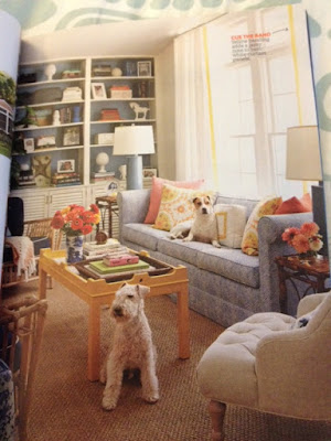
This is the room now....


What a difference! Covering the overpowering yellow hue with crisp white created a serene backdrop, plus the illusion of more space.  "Provide visual interest by arranging some books horizontally," says Eddie Ross. "You can also place accessories atop the stacks." Coating the built-in unit's interior with a pale blue added depth.

And how it looked before...
Don't you love seeing how the room evolved over time? 
and one more...

"The place was stuck in a seventies time warp," says designer Eddie Ross of this Long Island, New York, living room. And while homeowners Chris and Jackie Keber didn't exactly adore their Brady Bunch set, the couple had no intention of spending a fortune. So Ross focused on simple upgrades, rejuvenating the 350-square-foot room with minimal outlay.

This was the living room in the beginning...
That room has come along way!!!
We should all take a moment to say "Thank you" to the white paint that all this fabulousness possible!!

(And a big thank you to Geri and Laurie and my other readers who offered their magazines to me!!)

No comments :

Post a Comment

Ratings and Recommendations by outbrain